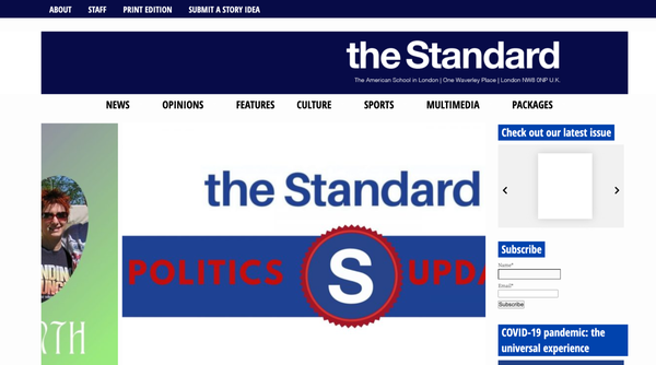

Standard.asl.org might be my most visited web address ever. As Online Editor-in-Chief, I'm responsible for the maintenance and posting on the site. I hope to use social media platforms and multimedia elements to make our journalism more compelling to our audience and to set the standard for digital journalism in the publication to inspire the rest of our staff.
As Online Editor-in-Chief, I was excited by the opportunity to be able to redesign the site. Over the past three years, our site has changed stylistically, but at its core, its functionality has remained the same. I re-designed our current site, to reflect some of the managing teams requests – serif font in the logo, a weather widget, and of course, a ticker with our most recent stories or announcements. Click on each image for a closer look at our site through the years.

Clunky media integration on any site really gets my goat. That's why I've worked hard to make sure all of our media is embedded seamlessly into our site.

Below are a few Instagram posts I've created during my time on The Standard. Click on each one for a better look at the photo and the reporting.

Part of my responsibility as Online Editor-in-Chief includes posting on Facebook and X every day we post to highlight the work we publish on the site. All of our staff members are required to provide a social media blurb along with their draft, so I can post their content to these platforms along with a hyperlink to the webpage on our site.

Gone are the days of the black and white newspaper. For readers to remain engaged – especially online – interactive multimedia elements are a must. Here are a few examples of interactive parts I've added to my stories.
I incorporated sound clips from an Israeli vigil and a Palestinian protest, so readers could get a feel of what these events were like. Adding audio to the story pushed on its pathos appeal. I also created an interactive Genially with a timeline and more photos of the events for users to click onto. To use, click on the play buttons.
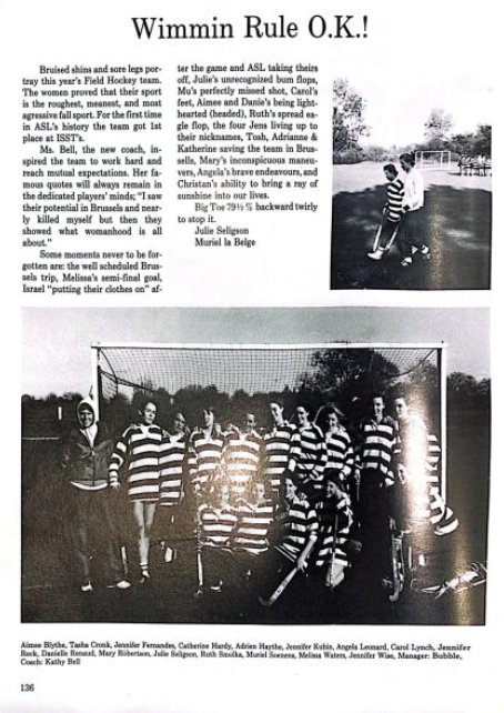
For this story, I tried to use multimedia to draw comparisons between the team that won in 1986 and the current team. I also wanted to use media to illustrate elements I hadn't already covered in the story. I used Juxtapose to create a comparison between the 1986 and 2023 teams; move the slider to use this element. I used Canva to show the team's road to victory, and I embedded an old yearbook image from 1986.
While photo galleries are a great go-to, I wanted to change up the way we display photography in parts of our site. In one of the stories I used the new Infobox feature on WordPress and in the other I created a photo story instead of a slideshow, so each photo of our fall musical could be appreciated in all its glory.

