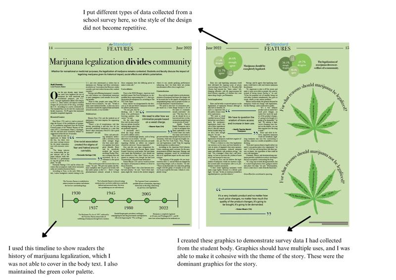

Design plays an integral role in relaying our stories. Through both our website and our print paper, I've tried to create and foster eye-catching designs that pulls the reader in and keeps them reading.
Although online is my forte, I love the process of laying out a page for our print edition in InDesign. Click on each image to read why I chose to incorporate certain elements into the layouts I've created.


During one class every print cycle, all 18 editors sit around a table and make copy and design edits. Below are some of the edits I received on my pages, and I edited my print page accordingly to create the final results above. Click on each iamge to look through the edits.

As Deputy Editor-in-Chief: Online, I was excited by the opportunity to be able to redesign the site. Over the past three years, our site has changed stylistically, but at its core, its functionality has remained the same. I re-designed our current site, to reflect some of the managing teams requests – serif font in the logo, a weather widget, and of course, a ticker with our most recent stories or announcements. Click on each image for a closer look at our site through the years.

Clunky media integration on any site really gets my goat. That's why I've worked hard to make sure all of our media is embedded seamlessly into our site.

While online is my primary focus, during our managing editor meetings, I brought up my idea to create a slideshow for all of our editors to add in preliminary images of their design. By doing this, editors could provide feedback to one another, and we could prevent overlap of design in several pages of our print issue.